
Friday, December 18, 2015

Thursday, December 17, 2015
Teens Inspired


I created a piece that was inspired by a painting in the NC Museum of Art. I took the element of silhouettes of people and altered it to the silhouette of a landscape. My painting is based off of a picture I took at a youth retreat as the sun was setting. No picture or painting could do justice to how beautiful the sky was, but I attempted. I chose this long canvas to give it more of a panorama feel and to try out a different kind of layout. It was hard to get the colors to look how I wanted them to and to make the orange water look natural because it was a reflection.

Wednesday, December 16, 2015

Tuesday, December 15, 2015

Monday, December 14, 2015


Thursday, December 10, 2015
That's a Punny story...;)
 |
| This is a family friendly movie about a doe devoted to his basketball team and his family. But this is no ordinary doe...this is a WINDOE! Part doe, part window, Windoe strives to show the world his true colors by being himself and being the best he can be! Because he looked different than his friends, all of the other deer/does/fawn/elk (you name it!) made fun of him and never let him join in any doe games. Luckily for little Windoe, and kind farmer came along and asked him to join the town basketball team. After discovering his skills, passion, and love of the game, Windoe became the star player! Then everyone loved him and honored him with a movie based on his story. Bring your family, friends, and folks of all ages to see the transformation take place from outcast to extraordinary! A sure favorite, come see Windoe and his friends in theaters near you this summer! |

Wednesday, December 9, 2015
Fancy Snowflakes

Response
I computer art, I use the photoshop program a lot to morph and manipulate images. This program has the tools to allow for changing the photographs to look the way you want. I also use paint and nontraditional materials to create non-digital art. Depending on what medium you choose, you can achieve different effects and outcomes. I like using different tools to switch it up, keep it fresh, and add pizazz.
Tuesday, December 8, 2015

Monday, December 7, 2015

Friday, December 4, 2015

Adventures at the NC Art Museum

My favorite painting was The Cliff, Ętretat, Sunset by Monet. I really liked the cool colors and the brush strokes in the water. It was very calming and it made me want to row a boat in that water.

This Corn Harvest painting was one that I didn't like at first. The super dull colors just threw me off and the shape of the broccoli trees was just unsettling. After looking at if for a long time, I decided the river and horse were nice and I grew to like it.

Wednesday, December 2, 2015

Monday, November 30, 2015
Disney: 3D

For this project, we used the website Tinkercad to design something to print with a 3D printer. I decided to make a replica of Minnie Mouse! This was a cool experience because I got to see how 3D printers really work. Tinkercad was difficult to navigate, but after a lot of practice and tutorials I finally got the hang of it. I used available shapes like spheres and butterflies to get the right look. I had to create holes on the back so that the piece would print on a flat back. This way, the design would have something to adhere to and not sink down. I'm glad I got to see how these machines work because they are a new developing technology that we will definitely see more of in the future.
Friday, November 20, 2015

Tuesday, November 17, 2015
Squeaky Clean

For this project, we were required to use nontraditional art materials. I decided to use rubber bands because I had a large 1/2 pound bag of them at home. After thinking through some ideas, I decided to make a rubber duck out of rubber bands. (Cute right?) I used the idea of twilling to curl rubber bands of different colors and sizes into small swirls. I glued these down until they formed the shape of a duck. This was a struggle because the rubber bands were very hard to work with, especially the thin ones. I quickly ran out of usable ones and had to find more. After weeks of endless glue gun burns and frustration, I finally finished the duck. For the background, I decided that since it was a rubber duck, he needed a bubble bath. I covered up the duck and blew bubbles mixed with food coloring to create colorful bubbles. I had to experiment with this effect to figure out the best way to get an actual bubble shape, not just splatters from the bubbles popping. This turned out to be a mess, but I finally decided to cut out some of the best bubbles and glue them to my background as well to create a layering affect. If I could do anything different, I would've not chosen rubber bands (because I do not like them anymore) and I would've tried to find a way to make the glue less visible on the final product.
Tuesday, November 10, 2015
Playing with Proportions
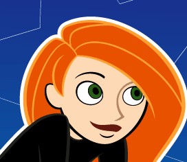


For this project, I morphed Emma Stone to look like Kim Possible because she has red hair also. I rounded her face, volumized her hair, rounded and enlarged her eyes, straightened out her smile, minimized her ear, and gave her a turtleneck. I wish that the liquify tool didn't add as much distortion and blurriness as it did, but I like the exaggerated proportions. I don't feel pressured by society to appear a certain way because I'd rather be myself.
Friday, November 6, 2015
Pink Pig: Parts of a Whole


For this project, I created a pig by combining different objects to form the proper shape. I began by choosing to make a pig, and I decided to fill it with things that are pink. After creating this collage by warping, resizing, and adjusting the hue of these images, I created a whole picture out of many tiny ones. I added in the purple to pink gradient for the background because it enhanced the pig and added fluidity. My favorite part is the face! It was a little difficult to get the collage of images to look like one animal, but I think changing it so they were all around the same value of pink helped.
Monday, November 2, 2015
Altered portraits

Friday, October 30, 2015
Translucent: Shimmering Slippers
Giraffiti

Friday, October 23, 2015
We are Santa's Elves

For this project, I made edible architecture. I decided to make little elf houses! They were originally supposed to be in a wintery North Pole environment, but I decided instead to give them summer homes! The houses themselves are red exotic fruits, and the shrubery is kale. I also added in windows, flower window boxes, pathways, doors, and a mailbox to make it more realistic. I love how the doors and windows look like they could really be a part of the fruit and they unify the piece so that it looks sort of like real houses! I am really excited for the elves to move in next spring, and there is also a nearby neighborhood for the rest of the elf population.
Thursday, October 22, 2015
Non Traditional Art Materials
This article discussed the use of non-traditional materials to make art projects. It posed the idea that buying from art supply stores is not as creative as picking out more unique items. In a way, I can see how using your imagination to utilize various things could produce more thoughtful and wild projects, but I also understand that you can be creative using paint and pencils as well. It's all a matter of how much thought you put into something and how you use whatever medium you decide on. It is a good idea to experiment with different materials to switch it up and add pizzazz.
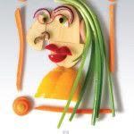


Here are some fun examples...
A portrait using vegetables

The pitchfork painting using balloons

Fish made out of water bottles

Dolphins made out of driftwood

A flag made out of lace
Thursday, October 15, 2015
Cinemagraphs: Always on the Move

Monday, October 12, 2015
Mix Tape Mania

For this project, I created a mix tape to mimic the sleeve/cover of an actual tape. I thought that I'd take it back to the days when kids actually knew what these were. I examined several different examples of old tape sleeves and started to create my own. Perfecting the measurements to make sure that each section was the proper size when it came to folding it was a challenge. After I figured out the size and portioned off the different sections, I tried to use common images and labels found on a tape such as the bar code, the dolby digital reference, the title, the publishing company, and a warning. It was really fun to come up with exciting song names as well.
A Dazzling Day in Disney World!

Friday, October 9, 2015
Olivia Gude Response
Olivia Gude describes the use and need for elements and principles of design. What I question is why she says there are "the big seven elements and principles" since there are more than seven. She might list the postmodern principles she thinks are most important, but in class we discussed several alternate ones. If this is the case, how do we know which ones are the most substantial? I like how she mentioned Dow's idea that the postmodern principles increase our creativity. They give us rules and an outline to follow while still allowing for creative ideas. I also like how she questioned the importance of learning about past and relevant artists. This is important because it cultures is and lets us see what is seen as successful art around the world. I think that by learning about other artists, techniques, and thought processes that we can think more outside the box in order to make something original.
Thursday, October 8, 2015
Howdy, Hybrids!


Saturday, October 3, 2015
MOOSE on the run
For this project, we came up with a word and created a question around it that we were supposed to try and answer through our art. I chose "wild," and after a lot of brainstorming, I decided to pose the question, "Can something wild really be contained." To demonstrate this, I sculpted a moose out of clay and sent it to the kiln. While I waited for it to cook, I worked on his platform home. I used a piece of wood and painted it green and brown like a forest floor. Then I created a fence to corral my moose by gluing twigs together. I used spray adhesive to stick little pieces of pinestraw to the bottom as well. When I got my moose back, I covered it in pinestraw, pinecone, and bark pieces. Using all of the outdoor elements was my way of keeping the moose wild, but the fence tries to tame him. Yet I included a gate door so that the moose can be free when he wants to and therefore the wild spirit in him can not be contained.


Monday, September 28, 2015
Apex Logo Contest
 |
 |
Subscribe to:
Posts (Atom)